
Celebrating Birds
Creating a logo and products for a bird event
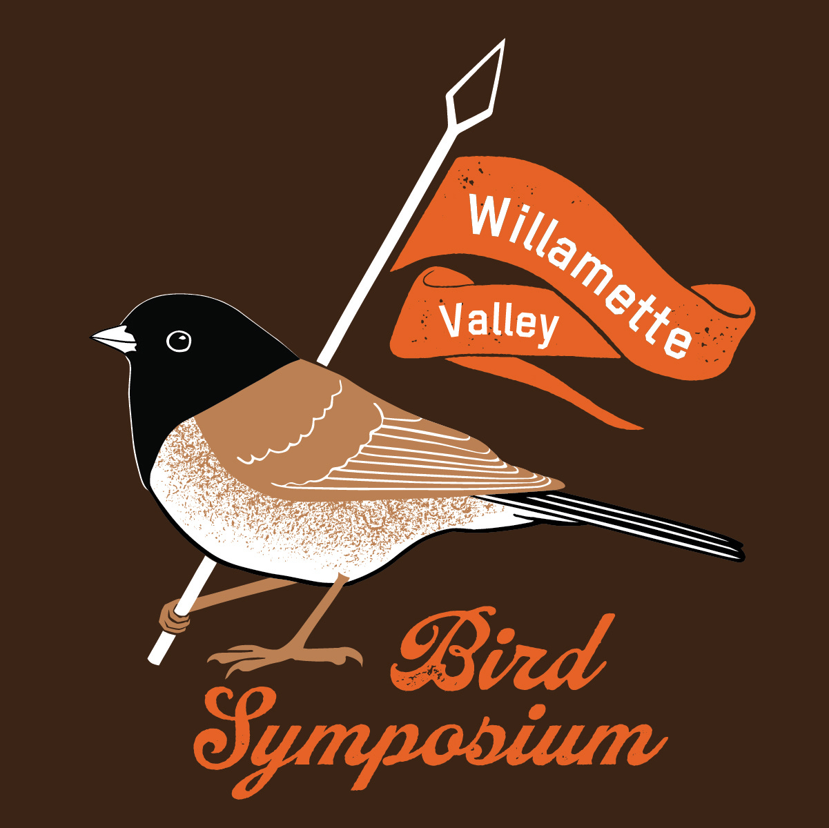
A couple of years ago, I was asked to create a new logo for the Willamette Valley Bird Symposium. This annual event is held in Corvallis, Oregon and hosted by Oregon State University. The symposium includes presentations by scientists and grad students and is attended by 300+ birders and professionals from the Pacific Northwest.
This opportunity was very meaningful for me. The Symposium is an event that brings people together to celebrate and enjoy their love of birds while they learn about how scientists are working to understand these creatures better. I feel a real kinship with the mission of the Symposium as I myself have a professional background in bird biology and spent years studying these amazing creatures.
Creating a logo and products for the Symposium also allowed me to express my gratitude for the role that birds play in my life. Not only do I draw and paint birds for a living, my husband is a professional ornithologist so birds and birding are very much a part of ordinary conversation at home. We even have a dog named Finch so my life is pretty much immersed in birds! Creating a celebratory image that would symbolize the importance of birds felt very much in my wheelhouse.
Research and Ideation
I started by looking into the vibe of the conference. In listening to the organizing committee, I picked up on brand attributes like looking to the future, professionalism, community, and participation. Since the committee wanted the new logo printed on beer glasses and coasters, I was inspired to base my illustration concepts on vintage beer labels or coaster designs.
I came up with three concepts to present to the committee.
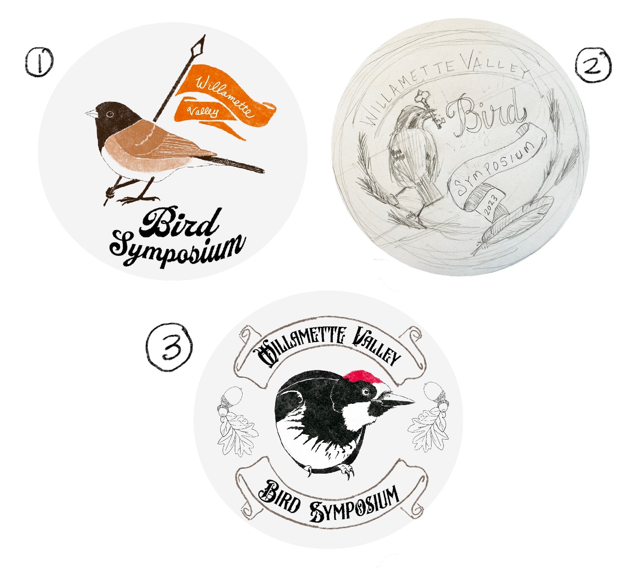
- Design 1 was based on a Dark-eyed Junco subspecies popularly referred to as the “Oregon Junco.” This subspecies is a very common bird in our region and instantly recognizable by bird enthusiasts. I anthropomorphized the bird by giving it a banner to carry which gave the image an upbeat and cheerful feel. The concept that I wanted to communicate was “leading the way.”
- Design 2 depicted a Varied Thrush holding a key in its bill which I envisioned as the “key of knowledge.” Varied Thrush is a Pacific Northwest endemic and is associated with old growth forests, making it a good representative species for an organization concerned with conservation of those ecosystems and their inhabitants.
- The third design utilized an image I already had on hand, an Acorn Woodpecker leaning out of a tree cavity. Both the woodpecker and the oak leaves and acorns call to mind another important conservation issue in our region, restoration of oak savanna habitats. Since the logo would be used for the first in-person meeting since Covid, the image was intended to communicate “coming out of hiding.”
Image Creation
The banner-bearing Junco was the overwhelming favorite of the committee and I got the go ahead to finalize the design. Because it was going to be printed on a variety of items, from t-shirts to signage, I knew I would have to vectorize the illustration. The t-shirts would be screen printed so I needed to keep the number of colors to a minimum. With those constraints, I went about figuring out how to depict the bird with clarity and incorporate the event name in a pleasing and concise image.
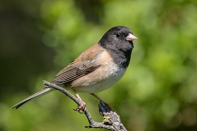
Oregon Junco males are described as having a slaty black head with chestnut brown back and rusty sides. Because the bird’s sides are a midtone value, I decided to use a texture to brush in the same color as the bird’s back, allowing it to read as a lighter value. I used a black outline for the belly (which is white) and repeated the back color for the legs. The banner and lettering for “bird symposium” are in orange, a nod to Oregon State’s school colors. I purchased texture brushes which I used to age the banner and orange lettering, as well as to paint the bird’s sides.
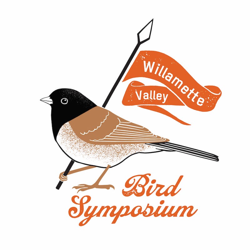
Now that I had a finalized vector image, it was time to go to print.
Printing on Products
This design got printed on a wide variety of products which all had different substrates with their own print requirements (vendors in parentheses):
- Beer coaster - paper (Sticker Mule)
- T-shirt - fabric (Shirt Circuit)
- Tote bag - synthetic fabric (4Imprint)
- Beer glass - glass (4Imprint)
- Event signage - plastic (Office Max)


Not only were there all these different substrates to deal with (all with different background colors) but only two of the items were handled by the same vendor. The adventure included being tasked with gathering quotes from each vendor, locating all the info needed to meet their printing requirements, and ultimately, sending off the image and troubleshooting the printing process when challenges arose.
Final Thoughts
Looking back on this project, my heart is full of gratitude. Sometimes when time has passed, I have mixed feelings about my work but this little jaunty Junco always brings a smile to my face.
One of the unexpected joys of this work was using so many different skill sets. Over the years, I’ve taken dozens of online classes to learn how to work with vectors, interface with print requirements, and make product mockups, to name a few. All those hours of learning paid off! Often, I think, it’s easy to take our skills for granted but this logo and product design reminded me of the many days I spent watching courses having no idea that I’d ever get work, much less work that was so close to my heart as this.
Another surprise was the pleasure of seeing the image on the products themselves. When working digitally, there’s no tangible object to handle. I had fun seeing this Junco on so many different items from shirts to coasters to the beer glass in my hand filled with a tasty brew! When I carry my tote bag to the grocery store sporting my own art, I feel uplifted and encouraged.
On a deeper level, I am grateful to create an image that has meaning for people. There’s a real sense of place in this logo from the “Oregon” in Oregon Junco to Willamette Valley which is where I live.